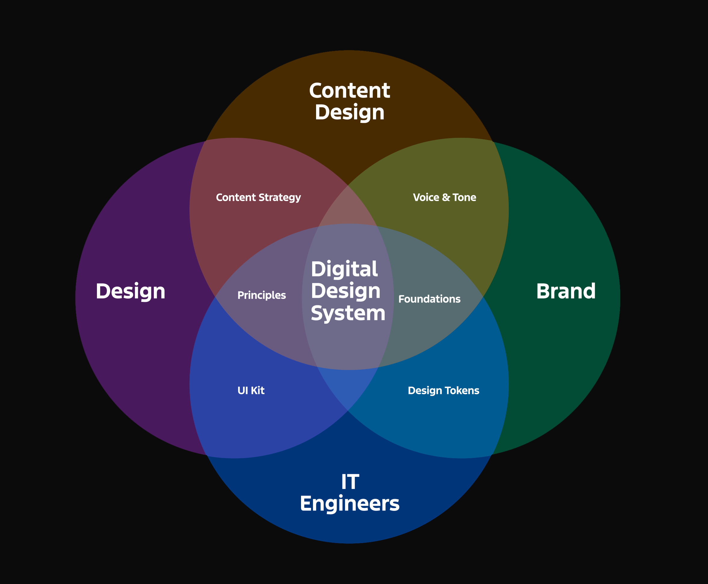
A design system is a comprehensive set of reusable components, guidelines, and principles that govern the design and development of digital products. It acts as a single source of truth, ensuring consistency and efficiency across all platforms and touchpoints and teams.
A design system is not just a style guide, a UI kit, component library or brand guidelines – it’s the strategic combination of all of these elements as well as others.
What I do
I bring together all the above areas into coherent, consistent design systems. This is done using the following process and methodology.
01. Define
I start by understanding your brand, users, and goals. Through research, audits, and stakeholder workshops, I identify core design principles, UI patterns, and accessibility needs. This foundational phase ensures alignment, consistency, and scalability across all products. Clear documentation sets the stage for a system that’s purposeful and future-ready.
Activities & Tasks:
– Stakeholder interviews and workshops
– Audit of existing design assets, UI components, and code
– Competitive analysis and UX best practice review
– Define system goals, success metrics, and KPIs
– Identify user personas and product use cases
– Create a design system brief and roadmap
– Develop a naming convention and taxonomy
– Document design principles and brand guidelines
– Establish accessibility and inclusion standards
– Outline governance and contribution model
02. Design
Then translate strategy into visual language—components, typography, colour, and layout—crafted for consistency and usability. Each element is carefully created in alignment with brand guidelines and accessibility standards. We build a flexible design library, tested for responsiveness and scalability, ensuring seamless implementation across digital platforms and evolving needs.
Activities & Tasks:
– Define foundational styles (color palette, typography, spacing)
– Create UI components (buttons, forms, modals, etc.)
– Develop design tokens for consistent values
– Build Figma component library with variants and states
– Conduct accessibility and contrast testing
– Prototype usage scenarios and interface layouts
– Review designs with cross-functional teams
– User test key components for usability feedback
– Align with brand and product design teams
– Iterate based on testing and stakeholder input
03. Deliver
I then turn design into reality through documentation, component libraries, and handoff to developers. Built at the core in Figma I would then integrate with tools such as ZeroHeight, Supernova and Storybook for easy collaboration. With version control, governance plans, and training, I ensure long-term adoption, clarity, and efficiency—empowering teams to build with speed and confidence.
Activities & Tasks:
– Handoff finalised components to developers
– Integrate with tools like Storybook or Zeroheight
– Write documentation for usage, guidelines, and do/don’t examples
– Set up version control and change management process
– Train teams on how to use and contribute to the system
– Launch internal communications and onboarding resources
– Collect feedback for continuous improvement
– Monitor adoption and track KPIs
– Schedule regular maintenance and updates
Who I’ve done it for
Working with some of the world’s leading brands across multiple sectors and disciplines.
